Layers of Invitation: A Village Hall Wall and the Order of Improvisation
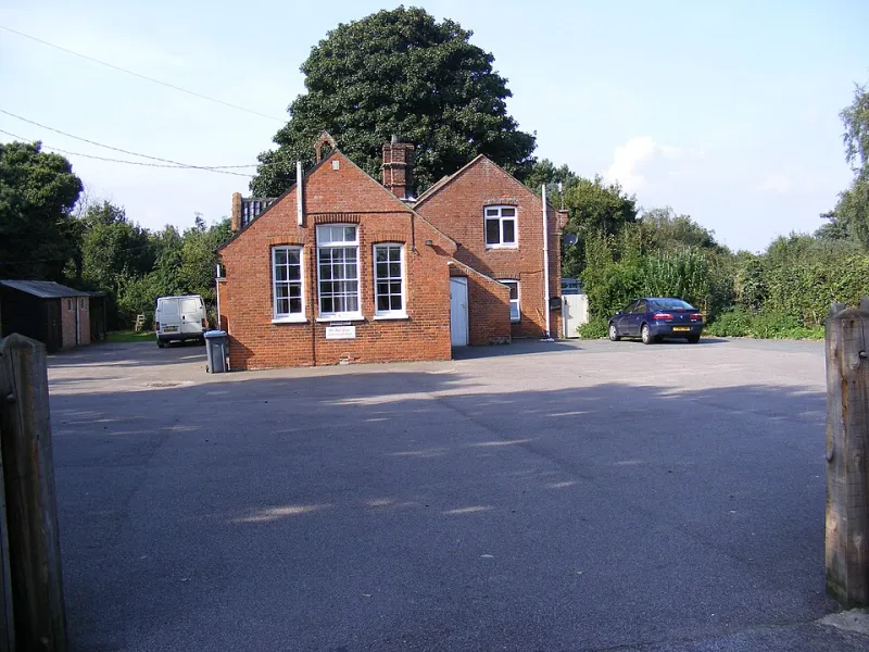
Photo: Adrian Cable, CC BY-SA 2.0, via Wikimedia Commons
On a damp November morning, the noticeboard inside a village hall is doing more design work than most studios would admit. It is a sheet of cork behind glass, or sometimes just cork, pinned with a shifting population of flyers, handwritten notices, parish council minutes and charity posters. Nothing is quite aligned. The edges curl. One notice covers the corner of another. And yet the board works. It is a public information system assembled by many hands, and it rewards close reading as an accidental information architecture.
The Board as a Changing Document
A noticeboard is not a fixed composition. It is a document with a maintenance cycle measured in pins. The top row often holds the recurring facts: hall bookings, a defibrillator notice, the parish council clerk’s contact details. The middle carries events: a coffee morning, a quiz night, a Christmas fair. The lower edge collects small ads, lost cats and the mobile library timetable. These zones are not enforced by a grid. They are negotiated by habit and height.
What interests me is how quickly the eye learns the system. A regular visitor does not read the board from top-left to bottom-right. They scan for colour, then for shape, then for a familiar word. A yellow poster means a fundraiser. A small white card with dense type means an official notice. A handwritten sheet in marker means something has changed recently. The hierarchy is not designed in the studio sense; it emerges from constraints, repetition and the physical limits of the board.
Overlap as a Feature
The most obvious fact about the board is that things overlap. A new flyer is pinned over an old one. A tear-off strip hangs across a date. A poster for a yoga class is partly obscured by a notice about a cake stall. In graphic design, overlap is usually treated as error, something to be corrected by spacing or hierarchy. Here it is a form of versioning.
Overlap records time. It shows that the board is alive, that someone came after someone else and had something more urgent to say. The older notice is not deleted; it is demoted by occlusion. This is a crude system, but it is also tolerant. It allows many authors to publish without asking permission for every square centimetre. The board succeeds because it accepts improvisation as part of its method.
There are lessons here for anyone designing for public spaces. A noticeboard that is too carefully composed becomes a poster. It stops being a system. The board needs enough structure to be legible and enough slack to absorb new material. The designer’s role is not to control every pin, but to set the conditions under which other people can add without destroying the whole.
Handwriting and the Limits of Brand
Handwritten notices are the board’s most human layer. They are rarely beautiful in a conventional sense, but they are often effective. A sheet of A5 with the words QUIZ NIGHT in thick black marker and the date repeated twice will outperform a pale pastel flyer at ten paces. Handwriting signals authorship and urgency. It also signals that the notice was made by someone who will be in the hall on Saturday.
This is a useful corrective to brand thinking. In a village hall, recognition matters less than action. The reader needs to know what, when and where. The designer’s palette is secondary to contrast, scale and repetition. A public notice has to survive photocopying, low light, glare on glass and the distracted glance of someone arriving for a keep-fit class.
Good templates for community use should therefore be generous rather than fussy. They should leave room for a handwritten addition. They should use dark type on light paper. They should repeat the date and time in two places. They should avoid pale colours that disappear under fluorescent light. The aim is not to make every notice look the same, but to make every notice harder to miss.
Designing for Misalignment
The board is never aligned. Pins are not on a grid. Edges do not meet. One poster is landscape, another portrait, a third is a strip torn from a larger sheet. And yet the eye can navigate it. The reason is redundancy. Colour, position, size and wording repeat the same message in different registers. A red poster for a charity supper, a handwritten note beside it, a strip of tear-off phone numbers below: three chances to be understood.
This is the opposite of a minimalist layout that relies on a single perfect hierarchy. Public design often has to tolerate interference. It has to assume that a corner will be covered, that a pin will obscure a word, that the board will be read in a hurry. The design notes that follow from this are modest but useful: leave a clear title band, use one dominant colour, keep the date and time large, avoid fine detail at the edges, and accept that the final composition will not be yours.
The village hall noticeboard is not a style to imitate. It is a model of governance. It shows what happens when design is shared, revised and occasionally covered up. For a portfolio used to final states, that is a useful influence. It suggests that a design system can be a set of permissions rather than a set of prohibitions, and that a little misalignment is sometimes the price of letting everyone speak.