Mattia Ammirati Design projects, influences and process notes.

Mattia Ammirati

Design projects, influences and process notes.

Latest Articles

The Kettle as Colleague: A Process Journal of Mugs, Biscuits and Interruption
Process

The Kettle as Colleague: A Process Journal of Mugs, Biscuits and Interruption

A studio’s tea round is often treated as background noise, yet it records attention, pressure and consensus more faithfully than many project documents. This article proposes a modest ritual log for capturing those moments without turning collegiality into surveillance.
The Tag in the Pocket: A Key Cutter’s Handwriting and the Limits of Legibility
Process

The Tag in the Pocket: A Key Cutter’s Handwriting and the Limits of Legibility

A visit to a suburban key cutter, and a close reading of the card tag that comes back with the keys: its ruled lines, its biro abbreviations, its eyelet and its creases. The article argues that this small, improvised surface is a truer index of local design literacy than many a polished portfolio.

The Last Impression: Type, Tone and the Studio’s Closing Paperwork
Process

The Last Impression: Type, Tone and the Studio’s Closing Paperwork

An invoice is rarely framed, yet it is often the last designed thing a client keeps. This process note considers how typography, payment terms and reminder language can carry a small studio’s values from the final handover to the bank statement.

The Quiet Sign-Off: Why the Studio Colophon Deserves a Place in the Work
Process

The Quiet Sign-Off: Why the Studio Colophon Deserves a Place in the Work

The colophon is often treated as housekeeping — a final page of credits, paper stocks and printer details. Yet when it is written with care, it becomes part of how a project is read, valued and remembered. This is a practical case for bringing the studio colophon back into the design conversation.

Damp Edges, Tight Briefs: The Coaster as Design Tutor
Influences

Damp Edges, Tight Briefs: The Coaster as Design Tutor

A small collection of British beer mats offers an unexpectedly rigorous lesson in designing for constraint. This essay reads the coaster as a wet-table typographic surface, where cheap print, pub light and a few square inches force decisions that many portfolios avoid.

Appointment with Clarity: Reading the NHS Letter as a Design Document
Process

Appointment with Clarity: Reading the NHS Letter as a Design Document

The NHS appointment letter is one of the most consequential pieces of public typography most of us receive, yet it is rarely discussed as design. A close reading of its paper, hierarchy, directions and tone suggests a set of priorities that studio portfolios would do well to borrow.

The Fridge-Door Broadsheet: Reading Takeaway Menus as Vernacular Typography
Influences

The Fridge-Door Broadsheet: Reading Takeaway Menus as Vernacular Typography

A close study of collected British takeaway leaflets as a vernacular design genre — laminated colour, crowded hierarchy, borrowed typefaces and practical shortcuts. The menu is not made to be admired, but its methods of clarity, repetition and urgency offer useful lessons for a portfolio.

The Twice-Seen Surface: Notes from a Carrier Bag Field Study
Influences

The Twice-Seen Surface: Notes from a Carrier Bag Field Study

A small field study of three British carrier bags, read as vernacular design documents. The 10p charge stamp, the 'Bag for Life' promise and the 6pt recycled-content line along the gusset reveal what it means to design honestly for a second outing.

The Adhesive Civic: Reading the Wheelie Bin as a Typographic Surface
Influences

The Adhesive Civic: Reading the Wheelie Bin as a Typographic Surface

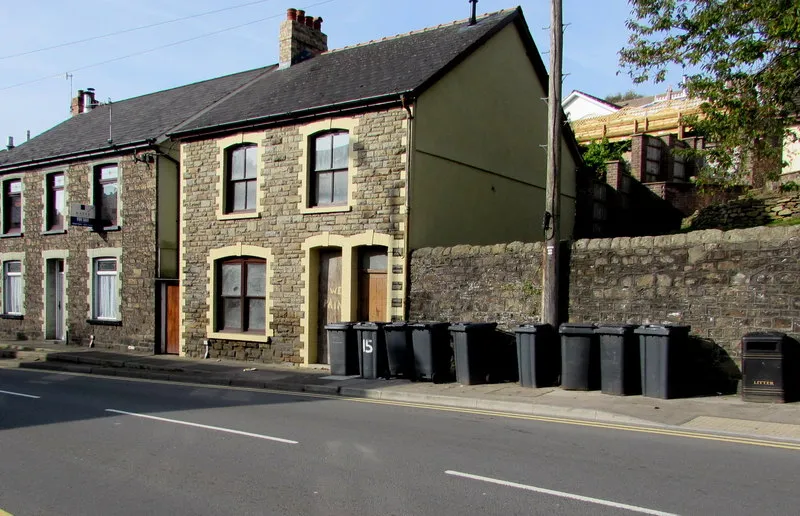
British wheelie bins accumulate council labels, house numbers, repair tape and improvised marker pen in a vernacular typographic system that is rarely designed and never curated. This field note proposes a way of reading that surface as civic evidence, domestic correction and accidental personalisation.

Plots of Invention: Reading the Allotment Gate as a Design Surface
Influences

Plots of Invention: Reading the Allotment Gate as a Design Surface

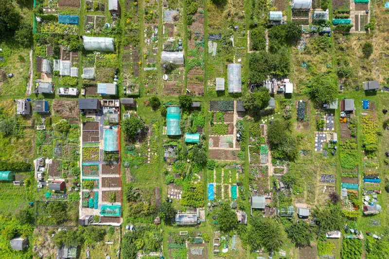
The British allotment is often treated as a retreat from professional life, yet its gates, sheds and seed packets form a coherent visual language built on use, repair and restraint. This article considers what the plot teaches about hierarchy, legibility and making do, and how those lessons might inform a more grounded design practice.

Paper Under Perspex: A Field Method for Roadside Notices
Process

Paper Under Perspex: A Field Method for Roadside Notices

A practical method for reading the layered notices found in bus shelters and parish noticeboards as civic design rather than background clutter. The article sets out how to observe hierarchy, weatherproofing, trust and urgency, and how to photograph and catalogue such surfaces without reducing them to picturesque local colour.

The Envelope and the Need: Notes on Designing for a Second Life
Process

The Envelope and the Need: Notes on Designing for a Second Life

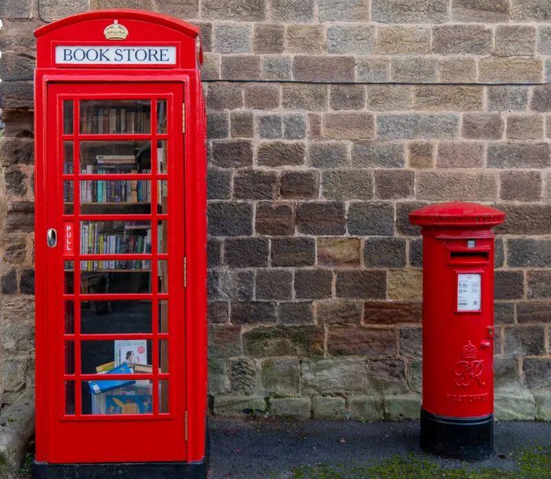
A study of adapted telephone kiosks across British villages and high streets, treated not as nostalgia but as a live lesson in constraint-led design. The kiosk offers a fixed envelope, a civic threshold and a maintenance regime; what changes inside reveals how longevity is really achieved.

The Second Glance: Civic Plaques and the Portfolio That Waits
Process

The Second Glance: Civic Plaques and the Portfolio That Waits

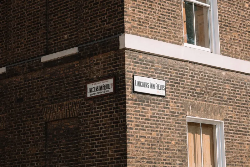
A walking survey of London’s commemorative plaques, read as a brief in restraint, siting and legibility. Process notes on making portfolio work that earns its place on the third or fourth encounter rather than the first.

The Standard Sheet: Designing Inside the A4 Habit
Process

The Standard Sheet: Designing Inside the A4 Habit

A4 is so familiar that it often disappears from view, yet it remains the quiet framework behind council notices, parish newsletters, takeaway menus and studio proofs. This article treats the standard sheet as a design instrument, examining how its folds, margins and photocopy logic shape everyday British visual decisions.

Before the Hello: Reading a Residential Street Through Its Door Furniture
Process

Before the Hello: Reading a Residential Street Through Its Door Furniture

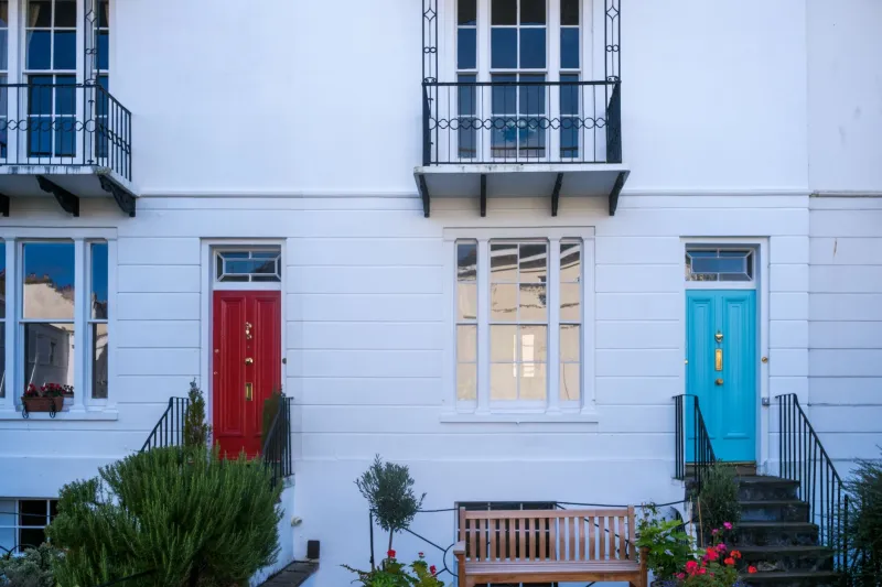
A survey of ninety doorways on one British street, and what handles, knockers, letterboxes and bell pushes reveal about era, weather and the etiquette of arrival. The notes that follow are less a history of hardware than a set of instructions for designing the first point of contact between a home and the pavement.

The Accidental Archive: A Year of Second-Hand Design References
Influences

The Accidental Archive: A Year of Second-Hand Design References

A year of charity-shop browsing has produced a shelf that no algorithm could have assembled: 1970s Letraset catalogues, discarded annuals and local pamphlets. This essay sets out what those accidental references have taught me about influence, and offers a simple audit and brief-making exercise for designers who want to look closer to home.

A Drawer of Nearlys: Classifying the Studio’s Unused Evidence
Process

A Drawer of Nearlys: Classifying the Studio’s Unused Evidence

Every studio keeps a shallow drawer in which judgement waits. This is a personal taxonomy of misprinted proofs, rejected swatches and paper scraps, sorted not for tidiness but for what they reveal about taste, hesitation and the quiet labour of editing.

Layers of Invitation: A Village Hall Wall and the Order of Improvisation
Influences

Layers of Invitation: A Village Hall Wall and the Order of Improvisation

A close reading of the layered flyers, handwritten notices and charity posters on a British village hall noticeboard, treated as an accidental information architecture. The board succeeds not through alignment but through overlap, repetition and improvisation.

The Unclaimed Minute: Notes Toward a Better Waiting Room
Portfolio

The Unclaimed Minute: Notes Toward a Better Waiting Room

Waiting rooms are among the most honest interiors in Britain: they must inform without alarming, seat without ranking, and fill time without wasting it. This is a self-initiated study of one such room — and a modest proposal for the minutes before the appointment.

Twelve Small Words, One Large Brief: A Lexicon of British Restraint
Process

Twelve Small Words, One Large Brief: A Lexicon of British Restraint

British clients rarely ask for what they mean outright. This working glossary translates twelve familiar phrases — from ‘tidy’ to ‘a bit more oomph’ — into decisions about type, colour, spacing and materials, with notes from real briefs and a page you can adapt for your own conversations.