The Standard Sheet: Designing Inside the A4 Habit
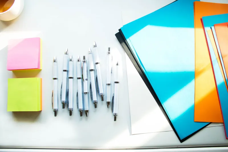
At a bus stop, on a library noticeboard, beside a till in a chip shop, the same rectangular promise appears: 210 by 297 millimetres. A4 is not merely a paper size. In Britain it is a social contract between the person with something to announce and the person willing to glance. It is the substrate of civic life, the default setting of the photocopier, and one of the most useful constraints available to a designer who is paying attention.
The Sheet as a Civic Instrument
A council notice, a parish newsletter, a room-hire form, a takeaway menu: each begins with the same physical fact. The sheet is tall, modestly proportioned and cheap to reproduce. Its ratio, rooted in the ISO 216 standard, allows it to be halved without losing its proportions. Fold A4 once and you have A5; fold it again and the logic continues. This is a quiet kind of elegance, but it is also a practical one. It means that a design made for a noticeboard can become a handbill, a leaflet or a insert without being redrawn from first principles.
The civic A4 tends to be pragmatic rather than polished. It is printed in the office, pinned behind glass, or slipped into a plastic wallet. Its margins are often generous because the printer demands them. Its hierarchy is usually blunt: heading, date, time, contact. There is no room for the ornamental indecision that a larger canvas can encourage. This is not a failure of ambition. It is a form of clarity that emerges from limits.
Folds as Editorial Decisions
A fold is not a neutral act. It divides a sheet into rooms. A tri-fold leaflet creates a cover, a spread and a back panel; a single fold creates a front and an inside. The reader’s hand participates in the sequence. In a church leaflet, the fold might separate the order of service from the notices. In a restaurant menu, it might separate the everyday from the weekend. In a studio proof, it might separate the approved from the unresolved.
Because A4 is so often folded, its design must be considered in three dimensions. A heading placed too close to a crease will crack. A photograph that crosses a fold will lose a face. A margin that looks generous flat may become cramped once the sheet is closed. The designer who works only on screen misses this. The designer who prints, folds and handles the sheet discovers that the page has a grammar of its own.
A Small Field Study
Over the past twelve months I have kept a simple record of A4 artefacts collected from everyday British settings: a parish newsletter, a takeaway menu, a library event notice, a tradesperson’s estimate, a studio proof, and a lost-cat poster. None was designed by a studio with a large budget. All were designed to do a job.
The parish newsletter used a 15-millimetre margin and a single-column grid. Its type was large enough for older readers and its headings were underlined rather than bold. The takeaway menu used a narrow margin and a dense two-column layout, with prices aligned to the right. The library notice used a photograph cropped to the top third and a QR code at the foot. The estimate was typed, signed and stamped. The studio proof carried pencil annotations in the margin. The lost-cat poster had the largest type of all, because urgency is a form of hierarchy.
What united them was not a style but a set of decisions made under pressure. Each had accepted the sheet’s limits and worked within them. The result was often more legible than a more ambitious piece would have been.
What the Photocopier Teaches
The photocopier is an editor. It reduces, enlarges, duplexes and crops. It punishes margins that are too tight and rewards contrast that survives a second-generation copy. A grey tint that looks subtle on screen may disappear entirely after copying. A hairline rule may break up. A photograph may turn into a dark rectangle. Designing for A4 means designing for reproduction, not just for display.
This is why studio proofs on cheap paper are so useful. They reveal what the screen conceals. They show whether the type holds at 100 per cent, whether the fold falls in the right place, whether the sheet feels comfortable in the hand. The proof is not a lesser version of the final object. It is a test of the object’s honesty.
Process Notes
In the studio, I now begin many projects with an A4 sheet before opening a layout program. I draw the margins by hand. I mark the fold lines. I write the first heading at the size I think it needs, then reduce it until it feels right. I print at 100 per cent on the cheapest paper available and pin the sheet to a wall at reading distance. If it works there, it will usually work elsewhere.
This is not nostalgia for paper. It is a way of testing whether a design can survive the ordinary conditions in which it will be seen. A4 is a constraint, but it is also a rehearsal space. It asks the designer to be decisive. It refuses the fantasy of unlimited canvas. In return, it offers a form of clarity that is peculiarly British: modest, practical and quietly deliberate.
The standard sheet is often overlooked because it is everywhere. That is precisely why it deserves attention. Constraint, handled with care, is not the opposite of creativity. It is one of its most reliable conditions.