The Unclaimed Minute: Notes Toward a Better Waiting Room

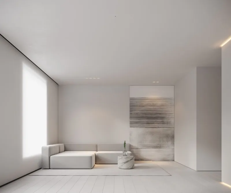
Photo: empty NHS GP surgery waiting room chairs posters natural light UK, via orlandothemeparkzone.com
On a wet Tuesday in October 2026, I sat for twenty-two minutes in the waiting room of a GP surgery in south London. The room was not badly designed. It was undesigned. The chairs were arranged in a loose perimeter, the noticeboard had been laminated into a single wall of paragraphs, and the clock was four minutes fast. Nobody seemed to mind. Everybody seemed to be enduring it.
I had come to observe, not to audit. I had a notebook and a pencil and no appointment. The receptionist assumed I was waiting for someone. In a sense I was: I was waiting for the room to explain itself.
An Interior That Asks for Patience
Waiting rooms are a British speciality. The GP surgery, the dentist, the MOT centre, the station concourse, the hospital outpatient department: each is a room where people arrive with a mixture of hope, dread and admin. The design brief is rarely written down, but it is consistent. Inform without alarming. Seat without ranking. Fill time without wasting it. Protect dignity in a place where dignity is already under strain.
These are not small asks. They are also not the kind of asks that attract ambitious design budgets. Waiting rooms are usually the residue of another project: the space left after the consulting rooms, the service counter and the fire exit have been accommodated. The result is a room that has been furnished rather than designed.
What I Found in One Room
Twenty-four chairs, four of them with arms. A low table with out-of-date magazines. A digital screen displaying a queue number in a font that had been chosen by a software supplier. A leaflet rack with six leaflets, three of which were about conditions that were not treated there. A poster about flu jabs, a poster about prescriptions, a poster about abusive behaviour. The most legible thing in the room was a warning. The least legible thing was a welcome.
The lighting was fluorescent and evenly unkind. The clock was high on the wall, which meant that anyone short-sighted had to guess the time. The seating faced the reception desk, so everyone watched everyone else arrive. There was no place to look that was not either another person or a notice.
None of this was cruel. It was simply unconsidered. The room had been assembled from available parts, and the parts had been chosen for durability, cost and cleaning. That is a legitimate brief. It is just not the whole brief.
The Constraints Are the Brief
Public interiors are governed by limitation. There is a budget, and it is not large. There are cleaning schedules, fire regulations, accessibility requirements, infection-control guidance and insurance. There is a reception team who must be able to see the room. There is a privacy threshold: not every question can be answered on a wall. There is the ordinary fact that anything loose will be moved, taken or broken.
A redesign that ignores these constraints is decoration. A redesign that begins with them is design. This is the part of the process I find most useful: the limitation does not arrive after the idea; it is the material the idea is made from.
A Modest Proposal: Four Moves
I have sketched a one-room intervention, small enough to be plausible and specific enough to be tested. It does not require a new building. It requires a weekend, a budget of a few thousand pounds and a willingness to edit.
One welcome, one warning. Replace the wall of laminated notices with two clearly separated panels: a welcome panel that explains what happens next, and a warning panel that keeps the essential safety message. Everything else moves to a leaflet or a screen. The welcome should be the first thing a person can read from the door.
Seating with a choice of view. Keep the perimeter, but turn four chairs away from the reception desk and toward a window or a wall. Not everyone wants to be seen while they wait. A small side table between two chairs gives people somewhere to put a coat, a bag or a hand.
A reading shelf with dignity. Remove the out-of-date magazines. Replace them with a shelf of thin, useful, locally relevant pamphlets and a few good books that can be read in ten-minute increments. The test is not whether the reading matter is improving; it is whether it allows a person to stop watching the clock.
Light and time. Change the fluorescent tubes for warmer, diffused light where the ceiling allows. Move the clock lower and put a second one where the seating turns away from reception. A visible clock is a courtesy. A hidden one is a small indignity.
What Waiting Teaches the Process
I have no client for this project. That is the point. It is a self-initiated study, and its value is in the questions it asks rather than the renders it produces. What does information design look like when its job is to reduce anxiety rather than demonstrate clarity? What does seating look like when it must serve a hundred strangers a day without making any of them feel ranked? What does a room look like when patience is treated as a design condition rather than an inconvenience?
In my own process, the waiting room has become a useful test. It reminds me that limitation is not the enemy of good work; it is the thing that makes good work honest. It also reminds me that civility is a design decision. The lower clock, the chair that faces away, the welcome panel that says what will happen next: these are small acts of manners, made spatial.
The minutes before an appointment are unclaimed time. They belong to no one in particular, which is why they are so often neglected. But a room that looks after those minutes is doing something quietly valuable. It is saying, without saying it too loudly, that the person waiting has not been forgotten.