Appointment with Clarity: Reading the NHS Letter as a Design Document
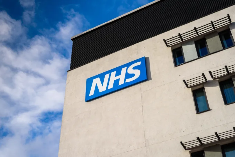
Photo: NHS appointment letter on kitchen table with envelope UK, via static.wphost.site
The envelope that sets the tone
It arrives without ceremony: a window envelope, a sheet folded twice, an NHS roundel in blue. The NHS appointment letter is not usually received as a design object. It is received as an obligation, a worry, or a date to be remembered. That is precisely why it deserves attention. Design that has to work under conditions of anxiety, low literacy and limited time is a better teacher than the polished brief that arrives with a generous deadline and a client who already understands the answer.
The letter is a document with a job to do. It must tell someone when to attend, where to go, what to bring and what will happen. It must do so for readers who may be elderly, unwell, distracted or reading in a second language. It must also protect the organisation: explain cancellations, offer contact routes, and avoid ambiguity that could become a missed appointment. The result is a piece of public typography that carries more responsibility than most campaign posters and more constraints than most brand guidelines.
Hierarchy under pressure
The first thing to notice is the order of information. The appointment date and time are usually prominent, but not always the most prominent element. The clinic name, the hospital site, the reference number and the instruction to arrive early all compete for attention. A good letter resolves this by giving the reader a single bold fact per block: the date, the time, the place, the action. The small print is not a dumping ground. It is where the conditions live: what to do if you cannot attend, who to call, what to bring, how to prepare.
This hierarchy is ethical rather than decorative. When a reader is anxious, they scan for reassurance and for the next step. If the bold type says only the trust's name, the letter has failed. If the small print hides the cancellation number, the letter has failed again. The design question is not 'what looks important?' but 'what does the reader need first, second and third?' That is a useful question for any portfolio page, any case study and any contact form.
Paper, print and the quiet dignity of the ordinary
The paper stock is modest. It is not a luxury object, and it should not be. The sheet has to pass through ordinary printers, fold into ordinary envelopes and survive an ordinary journey. The colour is often limited, sometimes mono, sometimes a single blue. This is constraint as a design method. The letter cannot rely on gloss, weight or finish to signal seriousness. It relies on spacing, alignment, plain wording and a clear sequence.
There is a lesson here for studios that equate refinement with surface. A portfolio does not become more credible because it uses a heavier paper or a more elaborate grid. It becomes more credible when the reader can find the work, understand the role and make contact without effort. The NHS letter is a reminder that clarity is not the opposite of craft. It is a form of craft that has been stripped of everything unnecessary.
Directions and the limits of words
Directions are where the letter is most exposed. A map may be reduced to a diagram. A bus route may be named but not explained. A car park may be mentioned without its entrance. The design problem is not simply typographic; it is spatial and behavioural. The reader needs to know which door, which floor, which reception, which queue. Words alone cannot always do this, but words can do more than they are often asked to.
A useful appointment letter gives the reader an escape route: a phone number, a web address, a named department. It does not assume that the reader will understand the difference between 'outpatients' and 'radiology'. It does not use jargon as a shortcut. This is a discipline that portfolios often lack. A case study may describe a 'holistic brand ecosystem' without telling the reader what was actually made. The NHS letter cannot afford that. It has to be understood on the first read, and designed for the second.
What the portfolio can borrow
My process notes from this ordinary document are short and practical. First, order the page by reader need, not by internal logic. The appointment time comes before the trust's history. Second, allow one bold fact per block. If everything is emphasised, nothing is. Third, treat small print as a place of dignity, not a place of exile. The cancellation policy, the access information and the contact route are part of the service, not an afterthought.
Fourth, test the document with an anxious reader. Ask someone who is not familiar with the project to find the date, the place and the phone number in under thirty seconds. Fifth, make apologies specific. 'We are sorry for any inconvenience' is a phrase; 'if you need to change this appointment, call this number before 4pm' is an instruction. Sixth, keep the identity quiet. The NHS blue is present, but it does not shout over the appointment time. A portfolio's visual identity should behave the same way: recognisable, but never more important than the work.
Seventh, design for the second read. The first read is for the date. The second read is for what to bring. The third read is for what to do if something goes wrong. A good letter supports all three without becoming a booklet. Eighth, include a route out. Every document that asks something of a reader should also tell them what to do if they cannot comply. That is not a legal footnote. It is a design courtesy.
A modest benchmark
The NHS appointment letter will never be a portfolio piece. It is printed in bulk, folded by machine and opened at kitchen tables. But it is a benchmark for whether design is doing its job. It asks for clarity under pressure, hierarchy under anxiety and tone under constraint. In 2026, when so much design conversation is about refresh, motion and distinctiveness, the letter remains a useful corrective. It reminds us that the most refined gesture is often the one that helps someone find the right door at the right time.