The Envelope and the Need: Notes on Designing for a Second Life
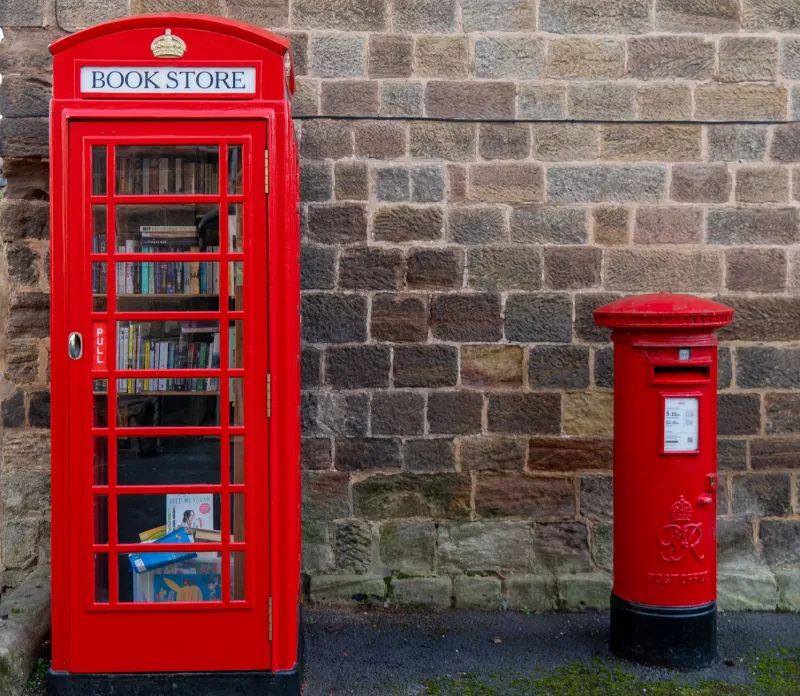
The red telephone kiosk is one of the few pieces of British street furniture that still reads as an object rather than an interruption. It has a silhouette, a colour and a place in memory. But the interesting part is no longer the call. It is what happens after the dial tone.
Over the past few years I have been collecting adaptations whenever I come across them: a book exchange on a village green, a defibrillator cabinet beside a busy junction, a tiny gallery in a coastal town, a coffee hatch on a station forecourt. The collection is not a preservation argument. It is a process note. Each example is a design brief that has been rewritten by a community, and each one asks a useful question for any studio: what does an object designed for one job teach us about being given another?
The Second Brief Is the Real Brief
The K6, designed by Giles Gilbert Scott and introduced in the mid-1930s, was never a neutral box. It was a piece of national infrastructure with a civic face: cast iron, small panes, a crown, a door heavy enough to feel official. Its original brief was narrow and clear. It had to be weatherproof, secure, visible, maintainable and unmistakably part of a network. Those constraints produced the familiar form.
The adaptations that work best accept that form rather than fight it. A book exchange, for instance, does not need a new building. It needs a dry shelf, a glass front, a light and a threshold that invites a second look. The kiosk already supplies most of that. The defibrillator cabinet needs something different: high visibility, quick access, a controlled temperature and a clear instruction panel. The same envelope can hold both, but only if the second brief is written with the same precision as the first.
That is where many well-meaning adaptations falter. The idea is sound, the volunteers are committed, but the brief is vague. Who opens it? Who checks it? What happens when the glass is broken or the shelf is empty? A second use is not a decoration applied to a retired object. It is a new design problem with its own constraints, users and failure modes.
Constraint as Grammar
In the studio, we often talk about constraints as grammar rather than obstacles. A fixed envelope is useful because it forces decisions. The kiosk cannot expand. It cannot be reoriented easily. It has a door, a floor, a roof and a set of glazed panels that determine how light enters and how the contents are seen. The designer cannot solve every problem by adding space, so the problem has to be edited instead.
That editing is the work. A community library in a kiosk succeeds when the selection is curated for the space, when the shelves are shallow enough for the door to close, when the lighting is robust and when the glass is clean enough to make browsing possible from the pavement. A defibrillator station succeeds when the cabinet is visible from a distance, when the access code or lock is obvious, and when the surrounding signage does not compete with the emergency instruction. In both cases, the kiosk is not a neutral container. It is an active collaborator with a strong opinion about scale, visibility and enclosure.
This is the lesson I borrow for portfolio work. Adaptable design is not the same as modular design. A system that can become anything often becomes nothing in particular. An object that is specific enough to be loved and plain enough to be changed tends to last longer. The kiosk is loved because it is recognisable. It is changeable because its interior is simple. Those two qualities are not in conflict; they are the basis of its second life.
Maintenance Is Part of the Drawing
A kiosk adaptation is a small civic agreement. Someone cleans the glass. Someone restocks the books. Someone tests the defibrillator. Someone reports the broken lock. If those agreements are not designed in, the object fails quietly and then publicly. The romance of reuse can hide a simple truth: longevity is maintained, not manufactured.
When we document these adaptations, we therefore ask three questions. First, what is the fixed envelope, and what does it refuse to do? Second, who is the second user, and what do they need in the first ten seconds? Third, who owns the second day, the second month and the second winter? The answers are often more revealing than the photographs. A beautiful adaptation with no maintenance plan is a temporary installation. A plain adaptation with a clear routine is infrastructure.
What the Studio Keeps
The red kiosk is not a relic. It is a prompt. It reminds us that an object can outlive its first purpose without losing its dignity, provided the second purpose is designed with the same care as the first. It also reminds us that civic affection is a material. People tolerate small inconveniences in objects they recognise and value. But affection cannot substitute for legibility, access or repair.
In process terms, the kiosk has become a useful workshop exercise. We ask clients to name their fixed envelope, their changing need and their maintenance agreement before we draw anything. The answers are rarely neat, but they are always clarifying. The best adaptable design is not endlessly flexible. It is specific enough to be cared for, robust enough to be used and modest enough to be handed on.