The Second Glance: Civic Plaques and the Portfolio That Waits
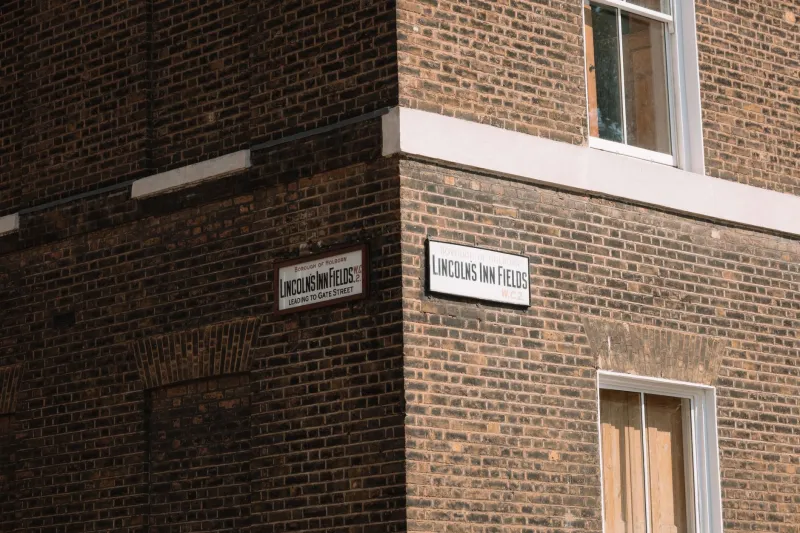
On a damp November morning I walked a short stretch of Bloomsbury with a notebook and no particular destination. The route was unremarkable: a terrace of soot-darkened brick, a former hospital, a pub, a couple of plane trees. What held my attention was not the architecture but the small, round, cobalt-blue discs fixed at first-floor level, each carrying two or three lines of white lettering. They are so familiar that they are almost invisible. That, I think, is the point.
A brief that does not raise its voice
The London blue plaques scheme began in 1866, and since 1986 it has been run by English Heritage. Its rules are quietly exacting: a plaque commemorates a person of national or international significance, usually at a building where they lived or worked, and only after a considerable passage of time. The design itself has barely changed. A standard diameter, a standard blue, a standard typeface — the lettering is set in a clear serif, sized to be read from the pavement rather than from across the road. There is no logo shouting for attention, no quotation, no illustration. The plaque offers a name, a profession, a date or two, and a building. It asks to be noticed, not admired.
Walking past the same plaque three times in a week — once in a hurry, once in conversation, once deliberately — I began to understand it as a model for a certain kind of design problem. Not the problem of being seen, but the problem of being found again.
The physics of the pavement reading
A plaque has to work at a distance of roughly four to six metres, at an angle, in poor light, against brick. That constraint governs everything. The lettering is relatively large but not coarse; the contrast is high but not strident; the circle is positioned at eye level for someone standing on the pavement, which means first-floor height on most London terraces. The text is short because length is the enemy of legibility. The material — usually cast iron or enamel — is chosen to survive decades of weather without becoming either invisible or ostentatious.
There is a useful lesson here for portfolio work. Much of what we make is designed for the first encounter: the thumbnail, the scroll, the three-second judgement. A plaque is designed for the fourth encounter. It assumes you will pass it again. It assumes that the first reading may be partial, that the second may be distracted, and that the third may be the one where the name finally connects to something you already knew. Its design is an argument for duration over impact.
What the plaque refuses
It is worth listing what the plaque does not do. It does not explain why the person matters. It does not quote them. It does not offer a portrait or a QR code or a website. It does not compete with the building; it sits on the brick like a seal, not a billboard. And it does not pretend to be the whole story. The plaque is an index, not an essay. It trusts the passer-by to do the rest.
That refusal is a discipline. In portfolio terms, it suggests a different relationship with the viewer: one based on invitation rather than persuasion. A project page that gives you the name, the date, the material, the constraint, and one good photograph may be more durable than a page that tells you what to think. The plaque model argues for a certain abstinence. Say enough to make the connection possible; say little enough to leave room for the second glance.
Process notes: designing for the fourth encounter
In the studio, I have been trying to apply this to a current portfolio refresh. The first move was to reduce the amount of explanatory text on each project page by roughly a third. The second was to change the order of information: constraint first, outcome second, reflection third. The third was to add a small, repeating element — a line of metadata at the foot of each page giving the year, the location, the material or medium, and the duration of the project. It is not decorative. It is there to reward the reader who returns.
The fourth move was harder: to stop designing for the screenshot. A portfolio that only works as a grid of striking images is a portfolio that has optimised for the first encounter. A portfolio that works when someone opens a single project page, reads for ninety seconds, and comes back a week later is a different kind of object. It requires a different kind of editing. It requires you to leave things out.
I have also been thinking about siting. A plaque is placed where the person lived, not where they are most famous. That is a form of honesty about context. In a portfolio, the equivalent is to show the work where it actually happened — the rough sketch, the awkward prototype, the version that was almost right — rather than only the polished final image. The plaque does not pretend that the building is a museum. It simply marks the place.
A small test for the studio
The blue plaque test, as I have come to think of it, is simple. Take a project page. Imagine a visitor who has seen it once, briefly, and has no reason to return. Now imagine a visitor who passes it again a fortnight later, and again a month after that. Does the page still have something to give? Is there a detail that only becomes visible on the second reading? Is there a piece of information that rewards patience rather than demanding attention?
If the answer is no, the page is probably doing the work of a billboard. That is not always wrong. But the streets we already walk past are full of quieter briefs, and some of them are worth learning from. The blue plaque does not shout. It waits. And in waiting, it teaches a useful lesson about what design can do when it is prepared to be found rather than merely seen.