Plots of Invention: Reading the Allotment Gate as a Design Surface
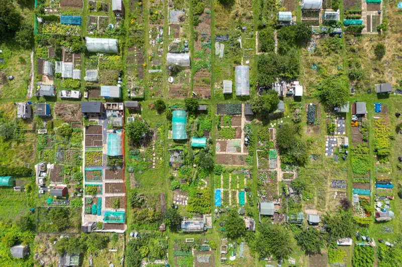
On a wet Sunday in October, the allotment gate is doing more work than it first appears. It holds a padlock, a laminated notice about water rates, a hand-painted plot number and a faded warning about dogs. Each element has been placed by someone with a practical problem to solve and limited materials with which to solve it. The result is not a designed system in the professional sense, but it is a visual language nonetheless: improvised, legible and honest about its own conditions. For a design studio, that is worth studying.
The gate as threshold and noticeboard
Allotment gates are modest pieces of architecture, but they carry a disproportionate amount of information. They must announce the site, regulate access, explain rules and accommodate the small dramas of communal life. The hierarchy is usually clear because it has been forced into clarity. The plot number is large; the committee notice is smaller; the lost cat poster is smaller still, and taped at an angle because it arrived later. Nobody has written a brand guideline, yet the gate works.
The lesson is not that designers should imitate amateur signage. It is that constraint produces a particular kind of order. When there is no budget for a new sign, the old one is amended. When there is no proper bracket, a cable tie will do. When the message must survive rain, it is written in marker on plastic rather than ink on paper. These decisions are practical before they are aesthetic, and that order of priorities is useful to remember. A portfolio, a poster or a wayfinding scheme can also be tested by asking what must survive, what must be read first and what can wait.
Seed packets and the typography of hope
Seed packets are among the most efficient pieces of visual communication in British retail. They must identify a variety, convey growing conditions, suggest a season and persuade a customer that the result is possible. The best examples use colour as a form of navigation: greens for leaves, oranges for roots, yellows for flowers. Botanical illustration carries authority, while the instruction panel carries the practical detail. The typography is often unremarkable, but the structure is not.
For a designer, the seed packet is a reminder that information architecture can be warm without being vague. A packet of broad beans is not trying to be a lifestyle brand. It is trying to get someone to sow at the right time and at the right depth. The visual pleasure comes from that clarity, not from decoration added afterwards. The same principle applies to editorial design and exhibition graphics: the reader should feel the structure before they notice the style.
There is also a useful lesson in the packet's relationship with time. The illustration shows an idealised vegetable; the instructions acknowledge weather, soil and failure. Good design can hold both. It can present a clear picture of what something might become while giving the user enough information to work with reality.
Sheds, repairs and the aesthetic of making do
Allotment sheds are rarely designed in any conventional sense. They are assembled, extended and repaired. A window may be a sheet of Perspex; a door may be a reused cupboard panel; a gutter may be a length of pipe cut and fixed with wire. Colour is often whatever was left in the tin. The effect can be charming, but it is not charm that makes it instructive. It is the visible evidence of decisions made under pressure.
This is where the allotment differs from the styled rural idyll often used in British lifestyle photography. The plot is not a picture of simplicity; it is a working compromise. Paint peels because the weather is real. Signs fade because the sun is real. Repairs are visible because time is real. A design practice that claims to value honesty should be willing to learn from surfaces that cannot hide their history.
That does not mean romanticising scarcity. Improvisation is not a substitute for proper resources, and making do is often a consequence of underfunding rather than a virtue. The point is to notice what resourcefulness looks like when it is not performed. It looks like a clear label on a water butt, a well-placed hook for a hose, a notice that tells you where the key lives. These are small acts of service design, and they are more useful than many polished posters.
A studio method drawn from the plot
The allotment suggests a method rather than a style. First, audit the surfaces that already exist. A gate, a noticeboard, a shed door and a seed tray are all interfaces, and each has an existing language. Second, test for distance and weather. If a sign cannot be read from the path in drizzle, it has failed. Third, let materials age. A design that only works on the day of installation is a fragile design. Fourth, keep a plot book. The best allotment holders record what they planted, when it failed and what they changed. A studio notebook can do the same for visual decisions.
There is also a lesson about personal expression. Allotment plots are highly individual, but they are individual within a shared framework. The site has rules, paths, water points and boundaries. Within that framework, a plot holder can paint a shed door blue, train beans over a homemade arch or arrange stones along a path. The result is not a free-for-all; it is a negotiated visual culture. Portfolios and studio identities might benefit from the same balance: a clear frame, then room for the particular.
What the plot knows
The allotment does not offer a ready-made aesthetic to copy. Its value lies in its priorities. It favours legibility over novelty, repair over replacement, and use over display. It accepts that weather will change the work and that the next person may need to amend it. For a designer, that is a useful corrective to the culture of the constant refresh. A visual language can be modest, situated and still precise. The plot knows this because it has to.
This autumn, walking between the beds and reading the notices again, the studio lesson is not to make design more rustic. It is to make it more accountable to the conditions in which it will live.