The Quiet Sign-Off: Why the Studio Colophon Deserves a Place in the Work
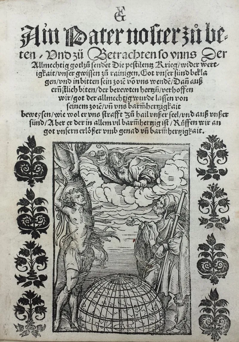
Photo: Print made by: Hans Burgkmair the Elder Published by: Sigmund Grimm Published by: Marx Wirsung, Public domain, via Wikimedia Commons
There is a particular kind of silence at the end of a well-made book. The main text has finished, the images have had their say, and then comes a page of smaller type: the colophon. It names the typeface, the paper, the printer, perhaps the binder, the editor, the person who made the index. To the casual reader it is furniture. To the designer it is evidence.
In a portfolio culture that tends to reward the visible gesture — the cover, the campaign image, the clever grid — the colophon sits at the opposite end of the room. It is the quiet sign-off. And that, I think, is precisely why it deserves another look.
A History Held in Small Type
British print culture has a long affection for the end-note. The private presses of the late nineteenth and early twentieth centuries treated the colophon as a small ceremony: a place to record the labour and materials that had made the object possible. The Kelmscott Press, the Doves Press and their successors understood that a book is not only a text but a manufactured thing, and that manufacture carries meaning. Later, Penguin’s paperback revolution made the credit line more democratic — designer, photographer, printer and proofreader all found their places in the back matter — but the principle remained the same. A printed object should be able to account for itself.
That tradition is not nostalgia. It is a useful corrective. In 2026, much of our work is distributed as pixels, but the portfolio still behaves like a printed object: it is assembled, sequenced, proofed and sent out into the world. A studio colophon acknowledges that assembly. It says that the work did not arrive fully formed, and that other hands, other materials and other decisions helped it along.
What the Last Line Changes
A colophon changes the way a project is read in at least three ways.
First, it distributes authorship without diminishing it. Design often presents itself as a solitary act of vision, but most projects are collaborations: a client who framed the brief, a photographer who waited for the light, a developer who made the page behave, a printer who held the colour. Naming those contributions does not dilute the designer’s role. It makes the role more precise.
Second, it records the material facts. Paper weight, ink, binding, typeface, screen stock, print run, file format — these are not trivial details. They are the physical conditions of the work. When a project is remembered only through a JPEG, the colophon restores some of its texture. It tells a future reader what the thing actually was.
Third, it creates a second reading. The main body of a portfolio asks to be looked at. The colophon asks to be consulted. It rewards the reader who stays a little longer, and it gives the studio a voice that is explanatory rather than promotional. In a market where every page is trying to persuade, a page that simply accounts for itself can feel unusually confident.
A Method for Writing the Studio Colophon
A good colophon should not read like a receipt. It should feel like the last room in an exhibition: smaller, quieter, but still designed. The following method keeps it from becoming an afterthought.
Begin with the object. State what the reader is looking at. Is it a book, a website, a signage system, a report, a set of printed cards? Give the format and, where relevant, the dimensions. This is the anchor.
Name the materials and processes. Be specific but not exhaustive. “Printed offset on 120gsm uncoated stock” is useful. “Various papers” is not. If the project is digital, name the typefaces, the build, the platform or the accessibility standard. The aim is to leave a trace, not to inventory the studio.
Credit the collaborators. Include the client, the photographer, the illustrator, the developer, the printer, the editor, the translator — whoever materially shaped the outcome. Use consistent naming and avoid attributing work that was not theirs. A colophon is not a place for guesswork.
Add one sentence of context. This is the human line. It might note the project’s purpose, the constraint that shaped it, or the date of completion. Keep it factual. The colophon is not the place for a manifesto.
Set it with the same care as the rest. The colophon is often the last thing designed and the first thing to be neglected. Give it a proper type size, a sensible measure and enough space. It should be legible without being loud. In a digital portfolio, it can live at the foot of the project page or on a dedicated credits page; in print, it belongs at the back, where it can be found rather than stumbled upon.
The Portfolio as an Accountable Object
The studio colophon is not a relic of letterpress nostalgia. It is a small act of editorial responsibility. It treats the project as something that exists in the world, with materials, collaborators and consequences. It also gives the studio a way to publish less loudly and more precisely — to let the final line do some of the remembering.
For a portfolio site, that matters. A project page can show the work, but a colophon can explain how the work came to be. The two together make a more complete record. In 2026, when so much design is presented as a stream of images, the colophon is a modest form of resistance: a claim that the details are worth keeping, and that the last line can be as deliberate as the first.