The Adhesive Civic: Reading the Wheelie Bin as a Typographic Surface
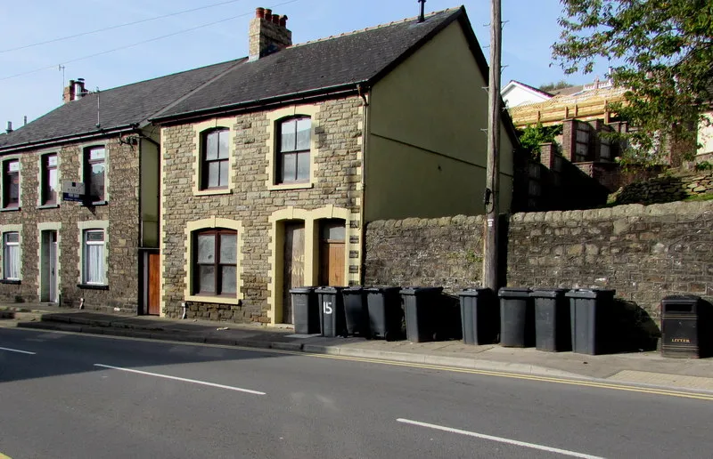
Photo: Jaggery , CC BY-SA 2.0, via Wikimedia Commons
The wheelie bin is not usually considered a designed object in the ornamental sense. It is a container, a compliance tool, a weekly obligation. Yet on the morning of collection, lined along a pavement in any British street, it becomes something else: a row of temporary display boards. Each bin carries a small, accumulated graphic record — council labels, house numbers, recycling instructions, repair tape, the occasional sticker from a football club or a charity shop — and together these marks form a folk typographic system that is more honest about civic design than many official publications.
The Bin as a Display Case
A bin is a public object with a private address. It sits at the boundary between household and highway, and its surface absorbs both languages. The council supplies the first layer: a moulded body, a coloured lid, a serial number, perhaps a printed panel explaining what may and may not be placed inside. These are the terms of service. Then the household adds its own corrections: a number painted or stuck to the side, a street name written in marker, a piece of gaffer tape holding a broken hinge, a label from a previous collection round that has never been removed. The result is not a mess, though it can look like one. It is a sequence of decisions, made under pressure, by people who are not graphic designers and who have no reason to think of themselves as authors.
What interests me is the way this surface behaves like a portfolio. It is layered, edited over time, and full of near-redundancies. A house number appears three times because each attempt failed in a different way: the first faded, the second was applied upside down, the third is a scrap of paper under clear tape. A council label sits beneath a domestic sticker, which sits beneath a repair patch, which sits beneath a newer council label issued after a change in collection rules. The chronology is legible only in fragments. You read it the way you read a wall of posters after the event: not for the original message, but for the evidence of weather, attention and repair.
A Provisional Taxonomy
The specimens I see most often fall into a few loose categories. First, the official label: printed, often self-adhesive, frequently rectangular, with a council crest, a collection schedule or a warning about hot ashes. These are designed to survive, but they rarely do. They lift at the corners, fade in the sun, or are partially removed by someone trying to tidy the bin. Second, the domestic identifier: a house number or name, usually applied by hand or with a bought label. These are the most variable in quality. Some are neatly stencilled; many are written with a permanent marker that has bled into the plastic. Third, the repair mark: tape, cable ties, a patch of plastic, a bolt. These are functional, but they also carry a visual signature — the width of the tape, the direction of the wrap, the colour chosen from what was available.
Fourth, the incidental sticker: a charity logo, a political campaign, a supermarket loyalty scheme, a warning from a neighbour about parking. These are the closest thing to personalisation, though they are rarely intended as such. A bin with a faded sticker for a local festival is not trying to be expressive. It is simply a bin that has been in use for a long time. Fifth, the erasure: a label scraped away, a number painted over, a patch of white spirit. Erasure is part of the system. It shows that the surface is contested, that someone has tried to correct the record.
Council Logic and Domestic Correction
The official design of a bin label is usually governed by legibility and durability. The text is large, the contrast is high, the layout is simple. But the label is designed for a generic household, not for a specific pavement. It assumes a standardised address and a standardised reader. The domestic corrections fill in what the official label cannot know: which bin belongs to which house, which side faces the road, which hinge is broken. They are not decorative. They are a form of local knowledge made visible.
This is where the bin becomes a useful influence for a design practice. It demonstrates that a system is never complete until it meets a user who has to make it work. The council provides the grammar; the household provides the syntax. A number written in marker is not a failure of the official label. It is a necessary supplement. The same is true of a portfolio: the project is not finished when it leaves the studio. It is finished when someone else has to use it, explain it, repair it, or live with it.
Tape, Fade and the Aesthetics of Repair
Repair tape is the most underrated material in this system. It is available in many colours, but the ones that appear on bins tend to be black, grey, or a faded neon. The tape is applied quickly, often in cold weather, and it rarely follows the geometry of the bin. It crosses labels, covers screws, and creates new edges. Over time, the adhesive breaks down and the tape curls, leaving a ghost of its former position. This is a kind of weathering that I find more persuasive than any distressed texture in a design software library.
Fade is equally important. A council label that has been in the sun for several years develops a particular patina: the red becomes pink, the blue becomes grey, the white becomes cream. The text remains legible, but its authority is softened. It is no longer a command; it is a memory of a command. The bin keeps it because removal is difficult and because the information may still be useful. This is not nostalgia. It is practical accumulation, and it produces a visual language that is difficult to fake convincingly.
A Method for the Pavement
Documenting these surfaces requires some care. The aim is not to intrude, but to observe. I usually work on foot, on a collection morning, before the bins are emptied. I photograph from the public pavement, keeping the frame tight enough to record the typography and loose enough to avoid identifying a household. I avoid photographing inside the bin, moving the bin, or standing on a driveway. If a resident appears, I explain what I am doing and offer to delete the image if they prefer. Most people are amused; some are suspicious; a few are rightly protective of their address. I anonymise house numbers in the notes, and I never publish a combination of street name, number and identifiable property.
The method is simple: one street, one morning, one roll of the eye. I note the time, the weather, the collection type, and the approximate age of the labels. I record the sequence of layers rather than a single specimen. I look for repeated solutions — the same tape, the same marker, the same improvised number — because repetition is where a vernacular system becomes visible. I also note the failures: the label applied to a curved surface, the number that has slid under a repair patch, the sticker that has been placed over the only instruction that mattered.
What the Bin Teaches the Portfolio
The wheelie bin is not a beautiful object, and it is not trying to be. But it is a designed object that has been edited by its users, and that makes it a useful influence. It reminds me that typography is often a negotiation between an official voice and a domestic one. It shows that repair is a visual act, even when it is not intended as one. It suggests that a portfolio might benefit from the same honesty: fewer polished surfaces, more evidence of use; fewer final statements, more layers that show how a project was corrected over time.
On the next collection morning, I will walk a different street and look again. The bins will be out, the labels will be fading, and someone will have written a number in marker because the official one was not enough. That is the system, and it is worth reading.