Mattia Ammirati Home

Category

Process

11 articles

Appointment with Clarity: Reading the NHS Letter as a Design Document

Appointment with Clarity: Reading the NHS Letter as a Design Document

The NHS appointment letter is one of the most consequential pieces of public typography most of us receive, yet it is rarely discussed as design. A close reading of its paper, hierarchy, directions and tone suggests a set of priorities that studio portfolios would do well to borrow.

Paper Under Perspex: A Field Method for Roadside Notices

Paper Under Perspex: A Field Method for Roadside Notices

A practical method for reading the layered notices found in bus shelters and parish noticeboards as civic design rather than background clutter. The article sets out how to observe hierarchy, weatherproofing, trust and urgency, and how to photograph and catalogue such surfaces without reducing them to picturesque local colour.

The Envelope and the Need: Notes on Designing for a Second Life

The Envelope and the Need: Notes on Designing for a Second Life

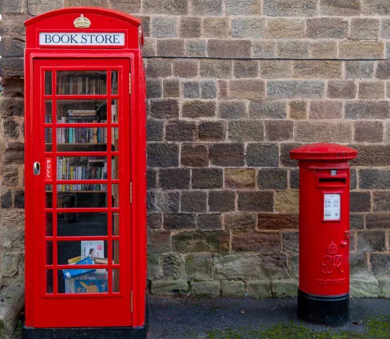
A study of adapted telephone kiosks across British villages and high streets, treated not as nostalgia but as a live lesson in constraint-led design. The kiosk offers a fixed envelope, a civic threshold and a maintenance regime; what changes inside reveals how longevity is really achieved.

The Standard Sheet: Designing Inside the A4 Habit

The Standard Sheet: Designing Inside the A4 Habit

A4 is so familiar that it often disappears from view, yet it remains the quiet framework behind council notices, parish newsletters, takeaway menus and studio proofs. This article treats the standard sheet as a design instrument, examining how its folds, margins and photocopy logic shape everyday British visual decisions.

Before the Hello: Reading a Residential Street Through Its Door Furniture

Before the Hello: Reading a Residential Street Through Its Door Furniture

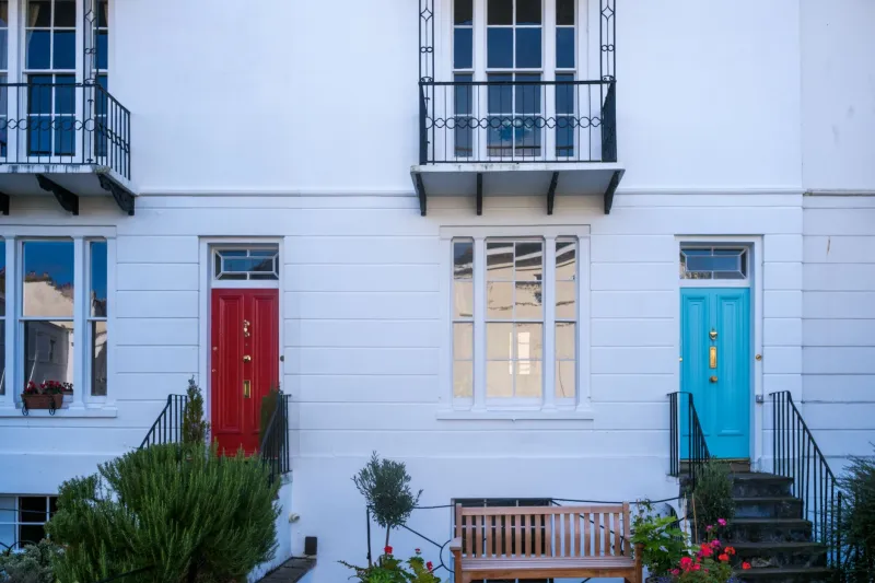
A survey of ninety doorways on one British street, and what handles, knockers, letterboxes and bell pushes reveal about era, weather and the etiquette of arrival. The notes that follow are less a history of hardware than a set of instructions for designing the first point of contact between a home and the pavement.

A Drawer of Nearlys: Classifying the Studio’s Unused Evidence

A Drawer of Nearlys: Classifying the Studio’s Unused Evidence

Every studio keeps a shallow drawer in which judgement waits. This is a personal taxonomy of misprinted proofs, rejected swatches and paper scraps, sorted not for tidiness but for what they reveal about taste, hesitation and the quiet labour of editing.

Twelve Small Words, One Large Brief: A Lexicon of British Restraint

Twelve Small Words, One Large Brief: A Lexicon of British Restraint

British clients rarely ask for what they mean outright. This working glossary translates twelve familiar phrases — from ‘tidy’ to ‘a bit more oomph’ — into decisions about type, colour, spacing and materials, with notes from real briefs and a page you can adapt for your own conversations.

Correspondence as Craft: Reading the Client Email as a Design Material

Correspondence as Craft: Reading the Client Email as a Design Material

A process note on how feedback, constraints and correspondence shape design outcomes, drawing on annotated excerpts from recent UK commissions. The argument is simple: writing and design are part of the same craft, and the client email is often where the real creative decisions are made.

Grey Is a Colour: Building Palettes Beneath a British Sky

Grey Is a Colour: Building Palettes Beneath a British Sky

A process note on making colour decisions when the light is rarely decisive. Drawing on a recent identity project, it sets out practical tests for paper and screen that begin with the weather rather than the swatch book.